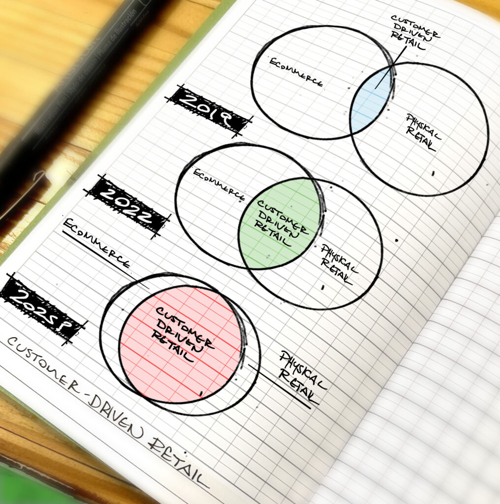
Usability is a principle that fuels quality design in digital merchandising. We consistently ensure that the user has the best experience possible. When creating a consumer solution, we make it simple to use and we build it with minimizing frustration in mind.
However, usability isn’t confined to that environment. It applies to our crucial day-to-day work practices as well. When we work with a client, we apply the principles of usability to our procedures. Our team has pooled their ideas, now we’ll share a few daily instances of usability in action that may surprise you.
Whether you call them business standards or usability practice, not everyone implements these in their day-to-day work. It’s the simple things we do each day that make our lives and, in turn, our clients’ lives, easier.
Leverage Dash Notation
With the increasing adaptation of smart phones you need to adapt your communication for ease of use by mobile users. Many smart phones dial directly from email signatures and websites. If you are using the fancy “dot notation” ###.###.#### you should consider reverting phone number formatting to the conventional “dash notation” ###-###-####.
Leave Informative Voice Messages
When leaving a voice message, if leaving your phone number, repeat it twice. Many people are multitasking and often miss your number the first time you say it. Also, give the recipient the reason why you called (just in case you forget!), and indicate any sense of urgency.
Use Precise Language
Stop using the language “Soon,” “When you get a chance,” “ASAP,” since they can be interpreted differently depending on the individual. After an internal meeting, we realized that even among us, there are different interpretations of these words which can lead to frustration. Be specific, use “Today,” “Tomorrow,” or “No later than Friday Morning,” “at X time.”
Provide Easy Access to Contact Information Whenever You Can
Always use your full email signature on every email you send. This way, all your information is in one place and people know where to go to find it. Also, include your vCard as a download from your website for easy access and integration into contact lists.
Keep your Email Signature Content Easy to Read
Choose your font and formatting wisely. Your email signature has a personality too. Avoid adding images or other graphical elements to your email signature. They often end up in the attachments section of the email and can lead to confusion.
Feel free to share anything that you do to increase your company’s usability.

